Sunday 7 December 2014

Three brush challenge


Three brush challenge 


using the only the rounded blending brush the foundation brush and the angled brush i was able to create a pop art makeup design.

Firstly I used the foundation brush to apply the white Illamasqua matte skin base to the face and the ears, i was aware that I had to apply a base colour to the neck but due to my client suffering with exzema i did not apply any products to this area.

Using the angled brush and the black supracolour i then started to draw lines around the features in order to make my client appear more cartoon.

Finally to using the blue and red supracolour and the rounded blending brush i created the dots on my clients face and applied colour to the tear underneath the eye and the lips 

overall i was really happy with my design i feel i have made a significant improvement with my application of makeup since I first started the course in September . The only thing i feel i could have improved on was making the dots on the face more even . I  also found i made a good choice of the threw brushes i used and found it generally quite simple to create a makeup look using the brushes of my decision .


Lichtenstein inspired pop art makeup (no date) pinterest. Portfolio Inspiration. Available at: https://www.pinterest.com/pin/447967494157673838/ (Accessed: 7 December 2014).
This was the inspiration for my my three brush challenge.


Friday 5 December 2014

Evaluation


Technical file evaluation

The technical file which we created over the semester, includes in depth information on the basic techniques we learnt such as contouring the face and applying foundation to the face. By including information on the techniques which we learnt each week this conveys to my tutor the clear understanding I have on how application of makeup, as well as being a good guideline to refer back to .

In the technical file I also wrote a short evaluation on how I felt about the overall outcome of my work, this conveys to my tutor what I feel I am confident with and what improvements I need to make. The photographs in which I take each lesson of my work also allows my teacher to compare my work to my evaluation, it also allows me to refer back to my work which I have previously created and compare it to the level of work I create.

In my technical file I also included face charts in which I created in order to portray my designs,  by listing the products used on the side of the chart it acted as a reminder so when creating the face chart on the face I was apply to remember what products to use .

The client consultation sheets  which I have included in my technical file also acts as a reminder on what products to use on each client in order to complement the skin.

By including information about the health and safety this shows that I have a clear understanding  of the safety needed in the studio , this helps me  to remain professional.


Final evaluation

Overall I am very happy with the amount of progress I have made since I first started the hair and makeup course at the beginning of September, I feel  that  I  have made a significant improvement on my application of makeup techniques particularly with my line work , which I had difficulties with during the dawn of the dead makeup week.  After practicing my line work several times I now feel more confident with applying designs to the face .I found the skills I learnt during this semester very useful. During the new Elizabethans topic I particularly enjoyed researching  the Elizabethans and found their interpretation on how to apply makeup to the face during their era  very fascinating. Even though I enjoyed researching about the Elizabethans I found we had a significant amount of coursework to do each week which I found overwhelming , however due to spending several hours an evening  doing the coursework  I felt I managed the workload well.

For my final design I wanted to incorporate Textures and materials from the Elizabethans clothing as well as the elements of a simple Elizabethan makeup into my final contemporary Elizabethan design, As a result I felt I demonstrated a clear understanding of the new Elizabethans .Overall I really enjoyed the new Elizabethans project and I am looking forward to the gothic horror topic which we will be learning next semester

Timed assessment in the role of the designer

Timed assessment in the role of the designer.

For my final Elizabaethan contemporary makeup look   i wanted to incorporated texture and materials from the Elizabethans clothing into my design .

applying the base colour

Apply the matte illmasqua skin base colour which is quite a pale colour to the face neck and ears, then blend out using a buffer brush once the product looks even on the face seal the makeup using the white illamasqua loose powder roll this onto the face using a sponge.

applying colour to the cheeks

For my final design  i wanted ot include a subtle colour to the cheeks, using the illamasqua pink from the blusher pallet apply the colour using the kryolan blusher brush to the circles of the cheeks, then using the kryolan glamour glow pallet apply the summer tan colour to blend out the pink and highlight the cheekbones.

applying the lace texture
next using the lace material to act as a stencil hold the fabric in place starting from the top centre of the forehead and suing the the roudned blending brush and the black pepper colour from the kryolan pallet stipple the colour into the face to create a prominent texture , carry this process out from the top centre of the forehead to the jawline on the right hand side of the face. The using the same technqiue apply several flowers from the lace fabric to the face using the black pepper colour and the red youth blush from the kryolan pallets this will help to create more design on the face. Finally apply self ahesive pearls to the centre peice of the flowers to make the design look more complete .

applying colour to the eyes

first apply a brown from the illamasqua pallet to the eyelid then using the black from the illamasqua pallet in order to create a smokey eye effetc highlight the socket area of the eyes, blend the colours well together using the roudned blending brush, the apply a white from the neutral illamasqua pallet just underneath of the brown line , using the black gel illamasqua eyeliner, highlight the lash line.Finally to complete the eyes apply white from the supra colour pallet to the eyelaashes using a  dissposible mascara wand.

applying colour to the lips

firstly outline the lips using a black lip pencil then using a dark red from the kryolan lip pallet apply the colour evenly to the lips and blend the colour together with the black lips liner in order to create an ombre effect on the lips.


After my partner practicing my design several times in lessons i altered my design particularly the positioning of the lace until i was happy with the look. On my original design the lace was positioned across the forehead just above the eyes however i felt this did not work well with my design. Due to practicing my final design in lessons i felt this helped my partner to become more confident with my final design  and focus on improving on elements which she struggled with .


For the timed assessment i created a face chart of my final design with the products which i used listed on the left hand side, i also wrote a thorough tutorial of how to create my design with step by step images on how to create the look .


Peer evaluation

I felt during the timed assessment my partner managed her time sufficiently and executed the design I had created well. The factors I felt she carried out successfully was applying the base colour and creating the lace texture effect on the face this was due to good communication between me and my partner as well as practicing my final design several times meaning that we were able to focus on practicing elements of my design which my partner needed to improve on and also altering parts of my design until I was satisfied with the final outcome.

The colour applied to my eyes I felt was blended well together creating the Smokey eye requested I wanted and the colour application to the lips were neat, although the liner and lip  colour could have been blended together better in order to create a prominent ombre effect.

I felt my partner made a good attempt at applying colour to my eyelashes, meaning that all the eyelashes were covered evenly some of the colour spread around the eye but my partner managed to correct this by blending the colour in underneath my eye and applying more of the  colour on the eyelid.

My partner struggled with applying the adhesive pearls to the flowers on my  face this was  due to the amount of powder applied to my face meaning the pearls kept falling off.

Overall I was very happy with the outcome of my design however , I felt my partner could improve applying more base colour to the neck.


Sunday 30 November 2014

comparison between stylistics in Elizabeth the Golden age and the new Elizabethans

comparing my final designs to Elizabeth the golden age
Anonymous. (2007). Elizabeth the golden age . Available: n. Last accessed 30/11/14.

After watching the Cate Blanchett Elizabeth the golden age film 2007, during tuesday lesson this gave me a chance to rethink my final designs and also to take into consideration the elements incorporated into the variety of hair and makeup designs throughout the film which reflect my contemporary designs.

The beginning scene in the film gave me inspiration for my final designs  particularly in terms of the hair designs. The hairstyles during the scene are taken back off the face with pin tail curls around the hairline, a rounded padding is also secured in the hair in order to achieve volume. I terms of applying padding to the hair in order to achieve volume this reflects on my final hair design however the instead of rounded padding secured hair for my final design i wanted to create a heart shape, however i wasnt entirely certain on how to style the remaining section of hair at the back of the head , during the beginning scene i noticed that Queen Elizabeths hair was styled into a plaited bun  with feathers and jewels included in the hair, this gave me inspiration for my final hair design, which i have now decided to style as a plaited bun with pearls secured into the bun.
Lina Ritchie. (23/08/2007). Regal Cate is crowning for glory once more Elizabeth I. Available: http://www.dailymail.co.uk/tvshowbiz/article-477260/Regal-Cate-crowning-glory-Elizabeth-I.html. Last accessed 30/11/14.


During another scene throughout the film, i noticed another character Bess who works for Queen Elizabeth, her hair is stlyed as a classic elizabethan updo with zig zag curls created out of the remianing sections of hair, this reflected on my final Elizabethan hair design, however after practicing my final design in the lesson i wasnt satisfied with the outcome of the zig zag curls and have decided to rethink my ideas.


Anonymous. (unknown). non stated. Available: https://www.pinterest.com/pin/123637952242793879/. Last accessed 30/11/14.


During the scene in the 2007 Elizabeth the golden age film when queen Elizabeth is scene sitting on her throne, it is noticeable that the section of hair used to overlay the padding had been zig zag curled in order to achieve volume, this tends to reflect on my final Elizabethan hair design, due to the section of hair to overlay the padding in my design is going to be crimped in order to achieve volume and also the wave plaits in my design are also going to be sitauted so they are secured overtop of the padding.
Stephanie Zacharek. (12/10/2007). Elizabeth "golden age". Available: http://www.salon.com/2007/10/12/elizabeth/. Last accessed 30/11/14.

During another scene throughout the film Bess who works for Queen Elizabeth, her hair is styled into a bun with a plait situated around it and accompanied with jewells the padding is also situated into a heart shaped, the elements from this hairstyle ressembles certain elements from final design.
Anonymous. (unknown). period makeups . Available: http://www.themakeupgallery.info/period/c16/uk/bess.htm. Last accessed 30/11/14.


The 2007 Elizabeth the golden age also tends to reflect certain elements from my final makeup design. For my final makeup design i wanted to include the use of fabrics and materials  the Elizabeths wore incorporated into the clothing as well as the style of makeup they applied to their faces.

Throughout the film Queen Elizabeths makeup reflects on the simple Elizabethan makeup design in which were attempted during our makeup fundamentals lesson, the base colour used on her skin is a pale white , a soft brown is applied around her eyes, a subtle colour is applied to the cheekbones and a soft pink is applied to her lips.The makeup Elizabeth is seen wearing throughout the film relfects on my final design in terms of the pale skin base colour and the subtle pink applied to the cheeks.
Anonymous. (unknown). C16th makeups. Available: http://www.themakeupgallery.info/character/cham/blanchett.htm. Last accessed 30/11/14.
 Throughout the film it is noticeable the gowns the Elizabethans are seen wearing have open collars which are designed from a lace material, particularly the scene where Queen Elizabeth is sat on her throne majority of the court ladies as well as herself are seen wearing gowns with lace collars. Another scene in which lace is incorporated into the Elizabethans clothing is when Elizabeth is seen wearing the blue gown, lace has been incorporated into the shoulder blades of the gown. The lace design recognised on majority of the gowns tends to reflect on my final design, i have decided to use lace as a stencil which will be powdered over using black eyeshadow in order to create a texture on the face.
Elizabeth: The Golden Age Movie Review
Roger Ebert. (11/10/2007). Elizabeth golden age. Available: http://www.rogerebert.com/reviews/elizabeth-the-golden-age-2007. Last accessed 30/11/14.

Fernando Blanco. (05/06/2013). Elizabeth the golden age five stars worthy historical review. Available: http://www.phistars.com/2013/06/elizabeth-golden-age-5-stars-worthy.html. Last accessed 30/11/14.


During the 2007 Queen Elizabeth film it is noticebale the alot of the clothing has pearls and jewels incorporated into their clothing as well as their hairstyles this also tends to reflect on my final makeup design . In my final design i am going to situate pearls in the centre of the flowers created from the lace stencil in my design.


Saturday 29 November 2014

timed assessment - in the role of the makeup artist

makeup assessment as the artist


Before starting our makeup assessment we had five minutes preparation time , in that time I took into consideration health and safety, which involved washing hands tying long hair back and laying couchroll over top of the work station, due to lack of couchroll and for health and safety reasons I covered my work station with a clean towel.

I reverted back to my tutorial which my partner had written out for me and scanned through the list of equipment I needed for her design, once I had all the equipment I needed I began to lay it out neatly across my work station. I then took into consideration my mirror lights were on and my partners face chart and makeup tutorial was taped to the mirror.

I then took into consideration whether the chair my partner was sat in was at a suitable height in order for me to create her makeup design and also made sure before starting her makeup that she was wearing a cape in order to avoid any makeup from going onto her clothing.

After the five minutes preparation time was finished I then had an hour and ten minutes to create her design. Before starting my partners design I did ask if she was able to remove facial jewellery but was unable to do so. Firstly I began by cleansing my partners face, making sure all makeup was removed.

I then applied my Illamasqua primer to her face using my foundation brush in order to give the makeup a better base. I then applied my matte skin base foundation from illamasqua to the face starting from the centre of the face and blending the product out into the hairline onto the ears and the neck. Due to taking photographs from the side of my partners face I took into great consideration covering and blending the product into the neck thoroughly. I also took into consideration the application of the product around the eyes and the nose. Once the base was applied evenly to the face I then blended the product into the face by using my buffer brush in a circular motion. Once the product was buffed into the face I applied my illamasqua loose powder to the face to seal the makeup.


Next I began to apply colour to my partners eyes she requested a smokey eye for her Elizabethan look. Firstly to act as a base colour I applied a brown from my illamasqua neutral pallet to the eyelids and blended the colour into the eye using my rounded blending brush. Next to the socket area of the eyes I applied a black from the neutral illamasqua pallet and blended the colour into the eyes using the rounded blending brush, I carried on applying these two colours from the pallet to the eyes in order to create enough layers in order for the colours do have a good intensity. I then used a gold from the illamasqua pallet and blended the colour over the black eyeshadow. I then applied a cream from the neutral illamasqua pallet to the brow line and blended the colour into the brown using the rounded blending brush. Next I applied a soft brown and the gold from the same pallet underneath the eyes. Using the gel eyeliner I then applied colour over the lash line using my angled brush to bring the eyes out .

I then applied colour to the cheeks of my partners design she requested her blusher to be quite harsh on the circles of the cheeks in order for her deisng to look more Elizabethan therefore using youth red from my Kryolan blusher pallet I applied colour to the circles of the cheeks and blended the colour into a summer tan colour from the glamour glow pallet which was a light highlight which I used to bring out the cheekbones.


Next I began applying colour to the lips. My partner requested the colour of her lips to be a royal red colour so using a red lip liner I went round the outline of her lips this made it easier for me to apply the colour to the lips. I then used my red MAC lipstick which I mixed with the mixing medium solution and applied the colour to the lips using the angled brush.

Finally to complete my design using the gel eyeliner I brushed the colour slightly through the eyebrows to make them more fuller and to give them more shape. Using a disposable wand and a  white from my supracolour pallet I wiggled the colour through my partners lashes in order to make her design look Elizabethan. I found applying the colour to the eyelashes generally quite difficult due to when applying the colour to the lashes it ending up on the eyelid and underneath the eyes causing me to have to retouch the eye makeup and apply more colour onto the eyelids.

Makeup evaluation


During and throughout the assessment as the makeup artist, I felt I managed my partners design reasonably well due to practicing in the studio in my spare time. The things I felt I carried out successfully in order to make the design work was the application of the skin base colour, I felt it looked even and was blended in well and also the colour application to the eyes, I was happy with how I blended the colours together in order to bring out the eyes.
Applying colour to the lips was something I struggled with in previous lessons on my partners design  however during the assessment I felt I applied the product considerably well to the lips as it looked even.
The outcome of the photographs which were taken I was also satisfied with I felt the photographs highlighted the strengths of my makeup and also by using the white background for my images instead of black complimented the application of the makeup.
Even though I was satisfied overall with the outcome I felt I needed to manage my time better perhaps as towards the end of the assessment I began to run out of time causing me to begin to panic meaning the application of makeup started to become slightly messy, particularly when applying colour to the eyelashes due to the colour spreading onto the eyelids meaning I had to spend more time reapplying colour to the eyes, I feel this is something to improve on.


practicing my final elizabethan design

Practicing my final Elizabethan design
 
For my final Elizabethan makeup design i decided i wanted to incorporate Elizabethan materials which they would use on their clothing and in thier hair , therefore for my final design i have chosen to use lace as a stencil and pearls.
 
I had several attempts at creating a face chart for my final design, on other face charts in which i had created i experimented with different colours such as reds and purple and took into conisderation the positioning of the lace stencil on the face.
 
After experimenting with my final Elizabethan look in lessons i found a design in which i was happy with and created a face chart which ressembled the design created in lesson.


for my final Elizabethan design i am going to have use the illamasqua matte foundation for the base colour and use lace as a stencil and go over the pattern using my rounded blending brush and black eyeshadow from the Kryolan pallet.The lace pattern will be situated the right side of my face.

Also by stenciling  over some flowers on the lace pattern using my red blusher from my blusher pallet and black eyeshadow from my kryolan pallet this helped to added of a stronger pattern and design .
In order to make my design look more aged and Elizabethan my partner experimented with the use of gold over top of the lace pattern however, i  feel by add gold to the design it disguises the texture of the lace , however in order to complete the lace pattern i have decided to purchase some  small adhesive pearls for the centre of the flowers on my design.
 
The colour i want to be applied to my eyes for my final design is a brown from the Illamasqua neutral pallet and a black from the same pallet to be blended into the socket area of the eyes. In order to bring out the eyes i have also decided to applied a white from the illamasqua neutral pallet to the brown line. I also want my eyelashes to be white for my final design to give a more contemporary Elizabethan look, therefore i am going to use white supracolour and a disspossible mascara wand.
 
Due to having so much colour on one half of my face i design i  decided i only wanted to use a subtle colour on the cheeks, i felt the pink from the illamasqua blush pallet applied to the circles of the cheeks and blended out into the cheek bones with a light colour from the kryolan glamour glow pallet would work well.
 
Applied to my lips i decided to use a dark red from the kryolan lip pallet and outline them with a black eyeshadow from my kryolan pallet and blended the colours together to create and ombre effect.


Sunday 23 November 2014

creating my partners final makeup design

Creating my partners final Elizabethan makeup design

During wednesdays makeup lesson i started to practice my partners final makeup design in order to become more confident with the design for the following  weeks assessment. In order to create my partners final makeup design, i referred to an image in which she had chosen and a rough face charts she had created.


My partners inspiration for her final makeup look came from this image, i referred to this image in order to create something similar for my partners final elizabethan makeup design.


Firstly i began by applying the illamasqua matte white skin base foundation to my partners face neck and ears using a foundation brush and buffed the product into the face in order for it to look more even.

For my parnters final makeup design she explained she wanted a smokey eye look applied to the eye with gold incorporated. In order to create this look i applied a black from my illamasqua matte eyeshadow pallet and then started to applied gold a gold from my illamasqua metalic eyeshadow pallet around the eyesocket using an angled brush which i found was easier to work with. We also experimented with the gold from the supracolour pallet but found the product sometimes looked to hevay on the eyes when applied. I then blended the colours into the eye using my rounded belnding brush and applied a white underneath the brow to bring out the black.

underneath the eye in order to avoid the makeup look from becoming gothic, we applied a softer brown colour blended in with gold underneath the eye using an angled brush. The softer colour underneath the eye worked well.


My partner decided  she wanted flase eyelashes  applied to the eyes and eyeliner applied to the lash line  in order to complete the look.

The colour my parnter wanted to applied a bright red to the cheeks for her final makeup look but wanted to colour to be blended up the cheekbones . I used a youth red colour from my kryolan blusher pallet to apply colour to the cheekbones.

Finally the colour my parnter wanted to apply to the lips was a royal red, in order to create this look i used the red from my MAC makeup collection which i felt worked well.

After speaking to Sue about the final outcome of my parnters makeup she explained the thing smy partner needed to consider was wheher the eyelashes worked and also whether the applciation of the red applied to the cheekbones worked.

After taking Sues advise on board My partner removed the false eyelashes and  I applied white from my supracolour pallet to the eyelashes, which we felt look much better and brought out the colour on the eyes.

After the lesson we stayed later in the studio in order to work on the application of colour on the cheekbones. In order to make the look overall more Elizabethan my partner decided shaping the red blusher into circles and then blending the colour out with a light colour from my glamour pallet  tin order to still highlight the cheekbones worked better.

Once my partner was happy with her final makeup design using my illamasqua matter skin base foundation and to retouch any areas which the makeup was starting to come away from such as around the nose and lips . Finally i used  the illamasqua loose powder which i rolled onto the face using a sponge in order to seal the makeup


After our makeup lesson on wednesday my partner created a final face chart in order to give my a reminder and clear idea on how she would like the final makeup to look.

Saturday 8 November 2014

Taming of the shrew review.

 The taming of the shrew review
 taming of the shrew retold . Available: m. Last accessed 2014

The taming shrew retold, is a modern version of the shakespearean play. After watching the movie of the Shakespearean romance, of a shrewish women who is forced into marriage and tried to be tamed there were certain elements throughout the film which reminded me of the Elizabethans .

The main Catherine's personality and clothing she is seen wearing particularly reflects the Elizabethan era.

The Shakespearean film, begins with the main Character Catherine storming around the office. Her hair is up in a bun with a slightly off centred partin which is a subtle symbol to highlight that Catherine is slightly not right and also slightly relates to the Elizabethan hairstyle with a modern twist, by styling her hair in a bun and focusing mainly on the partin her hairstyle.

Catherine is also a conservative politician, who is dedicated to her career and considers her job as a politician as far more important than her dedication to love. Her attitude towards love and her career slightly reminds me off Queen Elizabeth and how she is married to England during her reign.

It is noticeable that Catherine tends to wear clothing which mainly tends to focus on the style of collar incorporated into the design, for instance throughout the film many of her dresses and shirts which she is seen wearing include open collars, which slightly reflects on the style of Elizabethan gowns.

In another scene of the film where Harry is explaining to the Earl of Charnbury, who is looking for marriage on why it is a bad idea to consider marriage with Catherine, he tells him that she is a 38 year old virgin. I feel this is a deliberate symbol to highlight the Elizabethan era due to Queen Elizabeth being portrayed as the virgin queen.

In the film it seems as though Catherines mother and sister Bianca are trying to force her into marriage . And the Earl of Charnbury is looking to marry, due to a family death. Whilst watching the film of taming of the shrew it is noticeable that the main topic of the film is marriage which slightly reminds me of the Elizabethan era, where women were forced into marriage.

During the film the Earl of Charnbury becomes besotted by Catherine when he first meets her, the relationship between the two reminds me slightly of the relationship between queen Elizabeth and Walter when watching the 1997 Elizabeth film starring Cate Blanchett.

It is noticeable during the first few scenes in which the Earl of Charnbury is first seen, he is wearing an oversized brown fur jacket which was a very popular fabric in which the Elizabethans would like to wear. The style of jacket overall reminded me of medieval clothing in which the tudors could be considered to wear.

The outfit Catherine is seen wearing in the scene in the movie where Catherine is talking to her work colleague about the proposal is a black suit dress with white polka dots, this outfit in particular really reminds me of the 1585 Queen Elizabethan Ermine portrait.

Te wedding scene in the movie i feel this is the most significant part of the movie which relates to the Elizabethan era in terms of clothing. The characters in the film are seen to be wearing lots of different shades of purple .
The style of Catherines wedding dress is overall very Elizabethan looking but the open collar incorporated into the design tends to make the gown overall more Elizabethan .
During the wedding scene in the taming of the shrew retold movie, harry is seen wearing atop hat which relates to the Elizabethan era.
When the Earl of Charnbury arrives at his wedding reception, Catherine is disgusted by what he is seen to be wearing.However the outfit the Earl of Charnbury is wearing can be recognised as slightly Elizabethan, anaylising his look it is noticeable he is wearing tights which Elizabethan men used to wear, along with a long green velvet cloak, the style of the cloak tends to reflect the clothing which the Elizabethans wore particularly the men. The shirt which the Earl of Charnbury is seen to be wearing is also very Elizabethan look, not only due to the tudor style of shirt but also due to the colours incorporated into it.

The scene where the Earl of Charnbury , Catherine and Harry are at the hotel after the wedding ceremony can be considered as slightly Elizabethan. The room is lit with lightening which are shaped like candles which makes the room seem slightly more old fashioned. The food Available at the table of the Hotel room is cheese red wine and olives which reminds me of Elizabethan food.
The conversation between Harry and Catherine slightly reminds me of queen Elizabeth when he asks her if her career is more important than love and she agrees, due to Elizabeth portray the image of being married to England however Catherine changes her mind and decides that love is more important than her career.

The film ends by the Earl of Charnbury taming Catherine on their honeymoon . When they arrive back in London which i feel is a rather deliberate location for the film  due to the Queen Elizabeth by located in London, Catherine is besotted with the Earl of Charnbury and has become tamed, although when it comes to her career in politcs she still remains professional, which reminds me of Elizabeth and her being married to England.


Another character which i feel relects the Elizabethan era is Catherines mother in terms of what she is seen wearing throughout the film. At the beginning of the film she is seen wearing a luxourious pink velvet dress suit which signifys the Elizabethan era due to .Throughout the film I feel the jewellery she is recognised wearing is also very deliberate she is seen wearing statement jewells to match her outfits or pearls throughout the film which were also worn during the Elizabethan era.

At the wedding Catherines mother is seen to be wearing her hair as an updo with a flower incorporated into her hair to complete the hairstyle . Catherines mothers hairstyle at the wedding slightly ressembles the Elizabethan era due to the Elizbetahn women wearing their hair in a bun with usually materials such as pearls and feathers or headgear incorporated intot thier hairstyles.


Bianca who is Catherines sister is another character who reflects the Elizabethan era. The scene where Bianca and her finance are at the airport it is noticeable that they are both overexaggerated with pure white fur on them. Which was a popular fabric with the Elizabethans.

The scene where Bianca is at her home, it is noticeable there are many portraits situated aroudn the house of herself which reflects ueen Elizabeth in a way, due to Elizabeth having many portraits around her home in which she controlled what she looked like.

During the wedding it is noticeable Bianca in particular is wearing shades of purple in her makeup. Purple was a common colour in which the Elizabethans like to wear.
Anonymous. (21/11/2005). taming of the shrew . Available: http://www.bbc.co.uk/drama/shakespeare/tamingoftheshrew/writer1.shtml. Last accessed 12/11/14.


The image from the taming of the shrew retold highlights catherines personality and the clothing in which the Earl of Charbury is wearing.
Shakespeare Retold
Anonymous. (2005). shakespeare retold . Available: http://www.moviemail.com/film/dvd/Shakespeare-Retold/. Last accessed 12/11/14.

The image from the wedding scene of taming of the shrew. The image particularly highlights Elizabethan elements in terms of the shades of purple in which Catherine's mother is wearing and also the style of the wedding dress in which Catherine is wearing.

The new Elizabethans

Who are the new Elizabethans?
After reading an article on the top 60 people who are considered as a ' new Elizabethan' due to the impact the have created on the public. I have taken into consideration someone who i believe to be considered as a new Elizabethan.
Anonymous. (unknown). the new elizabethans : the full list . Available: http://www.telegraph.co.uk/culture/tvandradio/bbc/9277886/The-New-Elizabethans-the-full-list.html. Last accessed 08/11/14.
Nelson Mandela
Anonymous. (unknown). Nelson Mandela Biography . Available: http://www.biography.com/people/nelson-mandela-9397017. Last accessed 08/11/14.

In the image Nelson Mandelas facial expression in particular i feel highlights a sense of pride he has towards his country , Which reminds me slightly of Queen Elizabeth and how she was married to England. Analyising the image of Nelson Mandela it is noticeable the man is very wise which is also another reason as to why i consider him as a new Elizabethan.
Nelson Mandela i believe can be considered as a new Elizabethan due to the impact he has had on working towards his country. The former president of South Africa was to work towards freedom, in order to get his opinion across about freedom Nelson mandela even faced prison , when released from prision he carried on to pursue fighting for his country . Nelson mandela became the first ever black president in 1994 untill 1999 which was obvious to make an impact. Before he became president however in 1993 he recieved recoginition of his work towards his country winning a nobel peacemaking prize.
In 2013, Nelson Mandela died aged 95, hours after his death, thousands of citizens in south Africa rushed to his home in order to pay tribute. This therefore highlights that Nelson Mandela was a respected man . After his death, Nelson Mandela is still considered a major inspiration towards civil rights.

Anonymous. (unknown). Nelson Mandela sqaure staton. Available: http://www.southafrica.net/za/en/articles/entry/article-southafrica.net-nelson-mandela-square. Last accessed 08/11/14.
The image highlights the respect for Nelson Mandela , which is another reason as to why he could be considered as a new Elizabethan. The Statue which can be located in Mandela square is a symbol of worship and being the citizens ideal which is another reason as to why he may can be considered as a new Elizabethan.


final Elizabethan makeup ideas

Final Elizabethan makeup ideas

By creating a couple of face charts, researching  a variety of artists and Elizbaethan makeup designs i have thought of  a rough idea on how i want my final Elizabethan makeup to look.
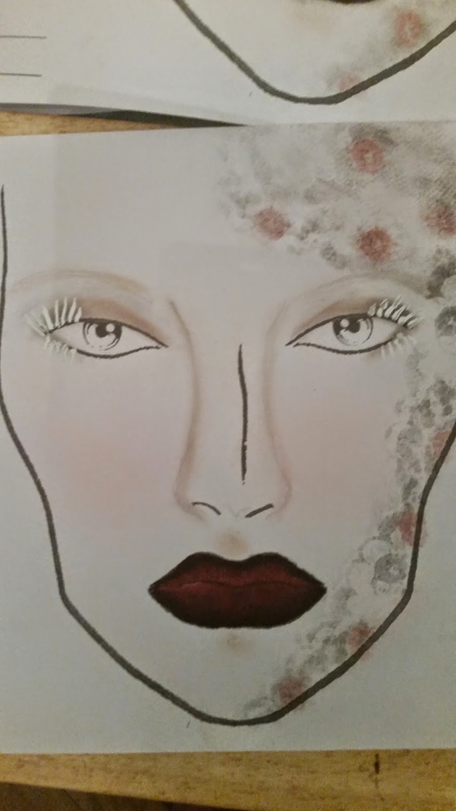
For my first face chart design i used a yoth red blusher from my kryolan pallet on the convex areas of the face such as the cheekbones and temples on the forehead. For the lips i used LC009 from my lip pallet, for the outline of the lips i used black pepper, a dark eyeshadow from my kryolan eyeshadow pallet.On the eyes i used to eyeshadow colours a light colour called white pepper which i applied to the eyelid and a grey colour called caraway from my eyeshadow pallet. for the eyeliner i used a red from my supracolour pallet and a white supracolour for the eyelashes and eyebrows .

I really like the outcome of my first attempt at my final Elizabethan makeup design. I wanted to really exagerated the use of red and white in my design.
On my second face chart design i applied a youth red to the cheekbones and forehead. To the lips i applied a red from my supracolour pallet. To the eyelids i applied a grey from my eyeshadow pallet and used a white supracolour which i applied to the eyelashes and eyebrows to create an Elizabethan makeup design.

By creating a second facehcart this gave me a clearer idea on how i wanted my final makeup design to look, on this facechart i have decided for my final look to change the colour of the lips due to the red on the facechart being to harsh.


Comparing the two face charts although both are very similar overall i prefer the first face chart design due to the makeup looking more complete. I also feel the first makeup chart is a good interepretation of contemporary Elizabethan makeup, due to the use of colours and they way the makeup  is applied.

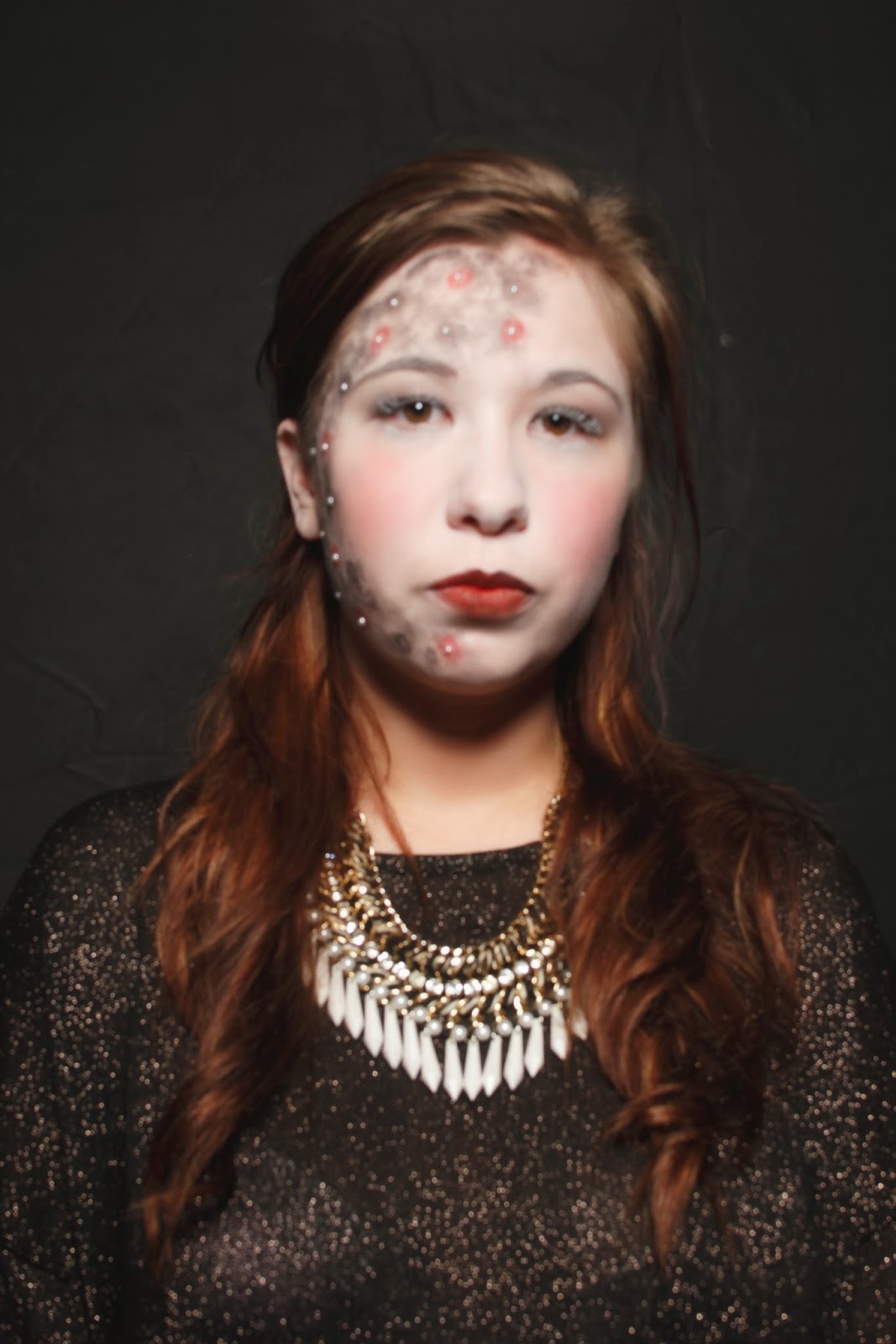
Once i created a couple of face charts which gave me a rough idea on how i wanted my final Elizabethan makeup design to look, i  then tried applying my makeup look from my face chart to th face. In order to give me a clearer idea on what needs to be changed or improved.

Firstly i began by applying a white base colour to the skin, from my supracolour pallet. Next i started to shade the convex areas of the face with a youth red blusher from my Kryolan blusher pallet.Next i applied a white pepper colour which was a light brown colour to the eyelids and layered up the creases of the eyelid using a darker grey colour called caraway from my kryolan eyeshadow pallet. In order to complete my Elizabethan look i applied white supracolour to the eyelashes.

By applying my final Elizabethan look to the face i have decided to make the skin base even paler due to wanting my overall look to really exaggerate the use of colour .  I habe also decided for my final look to change the colour of the lips to a lighter shade of red maybe a gloss rather than the supracolour due to the red i used in the image looks too harsh on the lips. Due to some thorough research I noticed that the women from the Elizabethan era did not really emphasise the eyes as much as the other features on the face, therefore i wanted to keep the eyelashes painted white but maybe consider changing the colour on the eyelids to a lighter colour. In order to make my final makeup design, look more Elizabethan i have decided to block  out the eybrows and applying a white base colour overtop .

Inspirations for my final design

Modern Elizabethan make-up
Anonymous. (unknown). modern Elizabethan. Available: http://www.pinterest.com/pin/536843218052003803/. Last accessed 8/11/14.

In this image of contemporary Elizbaethan makeup , i really like the used of colour applied to the face, the convex areas of the face are not overhighlighted and the colour of the lips contrasts well with the white skin base, although the colour of the lips is a harsh colour it works well with the makeup look . I really like the texture of the eyebrows in this makeup look, i feel it completes the look.
Thom Browne
misty white Sidell. (10/09/2013). Thom Browne eerie New York Fashion Week show is inspired by Elizabethan clowns and preppy Americana .Available: http://www.dailymail.co.uk/femail/article-2416513/Michelle-Obama-favourite-Thom-Brownes-New-York-Fashion-Week-inspired-clowns-Americana.html. Last accessed 08/11/14.

Another makeup look which i found inspiring was the overall look designed by Thom Browne. Although the makeup is quite plain i feel the use of only three colours red black and white contrast and really works well with the overall look .
Antique makeup #stage
pinned by Marga Mun. (unknown). Rebecca Saray. Available: http://www.pinterest.com/margamun/rebeca-saray/. Last accessed 08/11/14.

Another makeup look which i found inspirational was the antique stage makeup image. I really like how the makeup has been applied to the face, the colour applied to the cheeks is realy subtle and contrast with the white skin base colour making the makeup look slightly periodic. I also really like the used of the silve colour applied to the eyelids i feel it really brightens the eyes up. The purple colour applied to the lips works with the overall makeup look however i think maybe a colour which is less harsh like a lilac or a gloss would complete the look .


After having a one to one tutorial with my makeup tutor Kat Vogart, I decided to rethink about my makeup design . Once showing Kat my previous makeup design for my final Elizabethan makeup she explained that my look which  created to others was a similar design to what others had created therefore i decided to think slightly outside of the box.

I decided for my final elizabethan makeup design I wanted to incorporate lace onto the face for my final look. The skin base will be white, due to using the Illamasqua matte skin base foundation in a previous makeup lesson where I created a simple Elizabethan makeup design, I decided this product will be a suitable product for my final design. I then wanted to incorporate a lace pattern onto the face which will be in black, i decided this colour will work well with the white skin base .On the eyes i decided i wanted to apply darker colours such as lacks and greys in order to create a smokey eye effect. For the lips I felt a dark red colour will work well with the contemporary look. In order to complete my Elizabethan look I have decided slight contouring applied to the cheekbones will work well.

pinned by laurenellemua. (unknown). not stated . Available: http://www.pinterest.com/laurenellemua/photo-shoot-love-lace/ (viewed 11/11/14). Last accessed 11/11/14.
In this image i really like the colour scheme used , and how the lace as been situated on the face.


Anonymous. (unknown). lace makeup. Available: http://indulgy.com/post/Z6Z49pKxP1/lace-makeup. Last accessed 11/11/14.

The makeup in the image slightly reminds me of the Elizabethan era, due to the use of colour and the way it has been applied. I feel the black against the white skin works well and the red colour applied to the lips completes the look.


For my final design I wanted to incorporate textures into my design which reflected the Elizabethans clothing . I created a face chart in order to give me a rough idea on what i wanted my final design to look like .

For the base colour i wanted to use  a white matte illamasqua fountain base i didn't not incorporate this product into my face chart due to the product will be unseen against the white paper. 

To the cheekbones and jaw line I used the R12 pink colour from my blusher pallet .

For the lips i applied a pink colour from my lip pallet to the lips however i feel the colour is too light for my overall look and i am considering using a lighter colour.

To create a lace effect to the face i taped lace to the face chart which i used as a stencil in order to create the effect and using a blending brush and a black pepper colour from my eyeshadow pallet i dabbed the colour overtop of the lace .

For my final design i wanted to create a smokey eye look on the eyes . I applied a grey colour (caraway ) to the eyelid to act as a base and the shaded the darker areas of the eye using a darker colour from my eyeshadow pallet ( black pepper )

For the eyelashes on my final design i am considering painting them white using the white from my supra colour pallet. 

In order to complete the design i applied  gems to the floral areas of the lace on the face chart, for my actual design i am considering using pearls.

Once i had spoken to Kat about my final design  the things which she told me  i needed to consider is : a darker colour applied to the lips perhaps a red. and whether i am going to continue with my idea of using lace as a stencil and creating the texture to the face or whether i am going to incorporate the lace into my design by applying the material to the face. In order to have a clearer idea on what i want the outcome of my final design to look like i have decided i need to a few more face chart which are clear and portray how i want the makeup to be applied and perhaps also try applying my final design to the face to get a clearer idea on how my design is going to look.

I experimented with the use of the lace on a face chart firstly i cretaed a face chart with the lace applied to the face chart.
Firstly i applied the lace to the face chart using a glue and then went over the lace which was orignially white using a black eyeshadow pallet.
next using my illamasqua blusher pallet i applied a pink to the circles of the cheeks which i then blended out onto the cheekbones using a lighter colour pink.
To the lips i applied LC008 from the lip pallet which i then mixed with a white.

I like how the lace stands out on this face chart however i feel the material is hiding the technical ability of how the makeup is applied. The lace also covers majority of the eyes meaning the colour applied to the eyes is lost.


Next i created another face chart this time using the lace as a stencil. I firstly secured the lace to the paper using tape and then wnt over the lace using a black eyshadow from my kryolan pallet.
To the eyes i applied a brown to act as  a base coloiur from my illamasqua eyeshadow pallet and then went over thesocket area of the eys using a black from the illamasqua pallet.
The eyelashes were created using a white from my supra colour pallet .
To the cheekbones a pink from my blusher pallet was subtly added to the circles of the cheeks and then a hgilighter was added to bring out the cheekbones.
To the lips i applied LC008 from my lip pallet and then created an outline using a black eyeshadow which i then blended into the lip colour.

I felt the lace on this face chart worked better in comparison to the face chart were the lace was applied to the face chart rather than used a s a stencil as you can see the colour applied to the eyes better .


After practicing my previous face chart design where the lace was situated  across the forehead in my makeup lesson i didnt feel i was as happy as with the outcome as i thought i would be, therefore during my lesson i started experimenting with  how the lace was situated on the face . I felt that the lace worked well when it was situated on only one side of the face .

I also created a face chart with a darker colour applied to the lips i felt by applying a dark colour and outlining the lips with a black eyeshadow this worked well with my design.

Due to so much colour being applied on one side of the face i decided to keep the colour on the cheeks subtle therefore only applying a light pink to the face chart.

I also didnt want to add to much colour too the eyes , i felt it would take the focus away from the lace therefore i felt a smokey eye colour applied to the eyelids and outlined with a black eyeshadow around the socket area would work well.

The only thing i was unsatisfied with on the face chart was the neatness of the lace stencil on the side of the face.
This was my second attempt at the previous face chart i  created i felt the otucome of this atttempt worked better, the colours are applied to the face chart neatly and the lace stencil which i applied to the right side of the face chart is much neater than the previous one, the texture of the material is also clearer on this face chart in comparison to the first one .

However in order to complete the design i feel appling small adhesive pearls to the centre of the flowers would work.


One this face chart i wanted to keep the positioning of the lace stencil the same but change the colour. On this face chart i focused on using only pinks and purples. from my kryolan lip pallet and eyeshadow pallet.
I also wanted to experiment with making the eyes the main focus of my design rather than the lace, i felt the colours and the linework around the eyes worked well however in order to improve this face chart i feel the application of the makeup could have overall been neater.
On this face chart i firstly applied red lip colour from the lip pallet to the eyes eyebrows and lips, i then applied a gold from the illamasqua neutral pallet to the eyelids and a bright pink from my illamasqua blush pallet. In order to create the lace texture around the face i used a lace material as the stencil and using my rounded blending brush stippled the youth red colour from my kryolan pallet into the lace.


On this face chart i experimented with applying the lace stencil around the face chart. I also changed the colour shceme of the deisgn to red and gold on this face chart. I felt the application of makeup applied to the eyesand the use of the two colours together works well.